Pokémon
GO recently celebrated its fifth anniversary—another incredible milestone for
one of the most popular games of all time. And Trainers new and experienced
alike have all seen beautiful artwork appear as the game launches. Beginning
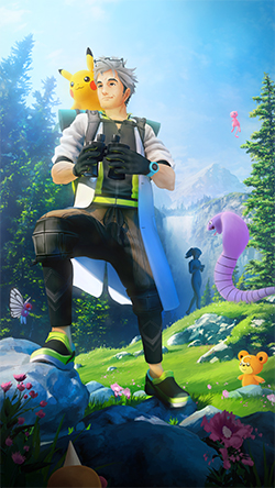
with the very first startup screen by Cody Lyon featuring an intimidating
Gyarados, these screens have invited players to explore from day one.
We recently had the
opportunity to ask some of the talented artists of these startup screens a
variety of questions about how they bring these stunning images to life. Read
on to hear from artists Mat Gilson, Susumu Yukuhiro, Saro Orfali, and Jason
Marino, and be sure to check out a gallery of artist Mieke Hutchins’s amazing
art at the end.
Pokémon GO Artists
Click on each startup-screen image to see it in full size!
Artist: Mat Gilson
What was your personal
experience with Pokémon before working on this project?
I recall seeing some of the
animation on television when I was young but didn’t really connect with the series
until I was much older and bought a Nintendo 3DS. Once I did, though, I quickly
went back and bought a ton of Pokémon games. The first was Pokémon Black
Version 2. I loved it! I was hooked! I went on to play all the Nintendo DS
and Nintendo 3DS releases. It was my love of the handheld games that was a big
factor in leaving my dream job at Industrial Light & Magic to come work at
Niantic.
Which Pokémon is your
favorite and why?
I think my favorite of all time is Bulbasaur. I love the cute, squat
forms of their body! The interesting combination of a dinosaur body fused with
the plant element of the nonblooming bulb on its back is such a unique
combination. The bulb is a beautiful symbol of growth yet to come once it
evolves into its next stage of Evolution, Ivysaur. It also has those amazing
tentacle vines to attack with! I just find it to be such a well-rounded and
novel design by Atsuko Nishida.
Do you have a favorite piece of
startup screen art that you’ve created? If so, what makes this one stand out?
My favorite startup-screen
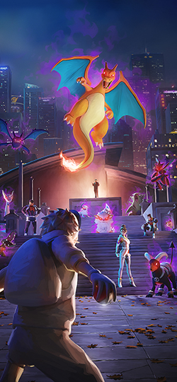
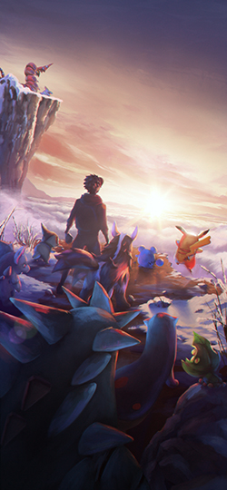
art that I’ve created is the Team GO Rocket loading screen. It was easily the
most fun due to the subject matter being much more epic in flavor and tone. I
loved the composition I designed for this one, putting the player avatar in
such a heroic, ready-for-action pose with the camera directly behind them to
give the viewer the feeling of being right in the thick of action with the
avatar.
I also loved building a symbolic representation of the monumental
mountain the player is going to have to climb and battle to reach the icing on
the cake that is Giovanni! It was a blast getting to pose these amazing new
Team GO Rocket characters and some of their Buddy Pokémon up the stairs leading
to the big boss himself.
It was also fun to throw a gigantic city in as the setting while giving
a fun little nod to the keen-eyed fans of the cartoon.
Where do you draw your inspiration
from when creating these pieces for Pokémon GO?
My biggest source of inspiration when creating these pieces of art is
the story I am trying to tell. Once I know what I’m trying to say, I’ll start
thinking about all the amazing comics and manga I’ve read over the years of how
those super-talented artists tell such engaging and visceral stories with a
single panel. Comics are an amazing source for learning how to add motion,
intention, energy, and emotion to a single panel of a story. Plus, the medium
is boundless in the types of stories it can tell, and I will take any excuse to
indulge in reading a comic.
How do you decide which
Pokémon to include in each new piece of art?
It varies depending on the loading screen but typically begins with
picking newly discovered Pokémon that are planned to be released during the time
period the loading screen will be featured. Other times, it might be a Pokémon
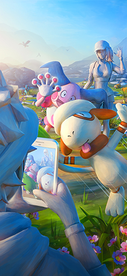
spotlighted in a new feature, like Smeargle in the photobomb loading screen I
did.
From there, I tend to look for Pokémon that will have complementary
colors or interesting silhouettes that balance or introduce interest to the
overall composition and story for the image.
The startup screens intend
to set a mood for players before they start exploring. How much do you think of
that goal when you design your art?
In every loading screen I’ve
done, I want the image to get the player excited to enter this amazing world
filled with vast amounts of beautiful, silly, fun, and scary creatures—and to
encourage the player to run around and explore the world while endeavoring to
collect them all! If I have not made you feel something positive—whether it’s getting
your heartbeat up about the challenge ahead, or get the corner of your mouth to
smirk at the sight of a Smeargle photobombing some Trainers taking photos with
their buddies, or bring a warm smile to your face at dedicated Pokémon and Trainers
taking pause to celebrate another beautiful year of playing a mutually loved
game together—then I didn’t accomplish the goal I set out to do.
Do you have any personal
techniques for getting into your creative space?
I definitely lean on music a lot to get me in the creative mood. I love
listening to a plethora of artists, but what I tend to listen to most are movie
or video game soundtracks when I’m working. It’s not really a specific artist
or style of music that really drives the visual end result, but more about
playing something that imbues me with energy. I love creating images with
energy and emotion, and just ensuring that I’m listening to something that
inspires me helps bring that out in my art.
Pokémon GO startup screens often contain multiple
smaller aspects that tell different stories within the larger piece. What is
your favorite component of each piece that you’ve done, and why?
I have really enjoyed adding subtle emotional or personality elements to
the characters. I am a storyteller at heart. I love seeing art that in a single
image can tell a viewer much more about a character or location than the single
moment the image is captured at. For instance, on the Team GO Rocket loading
screen, I really enjoyed having the rigged assets for each human character that
I could go and pose on my own as reference. For the avatar, I wanted to give
them a sense of pause or caution in the drawn-back, squat nature of the stance
they held in that moment. But at the same time, they had their shoulders
squared, Poké Ball in hand and at the ready to deal with the onslaught of Team GO
Rocket ahead of them. I really wanted this screen to feel epic—almost movie poster–like!
Another example is on the
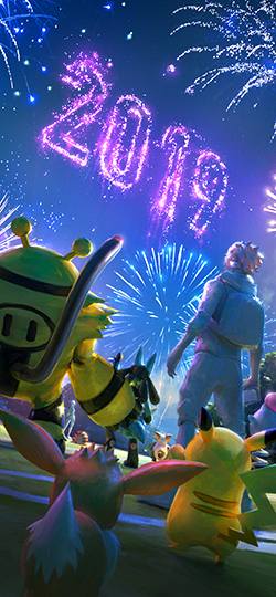
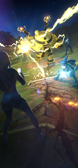
2019 New Year’s loading screen I did. My art director Susumu Yukuhiro suggested
we have the loading screen he did that was shown right before mine with
Electivire and Lucario locked in an epic head-to-head battle tie directly into
the New Year’s screen I was going to be doing. I loved that idea, especially
since my screen would show up in between the time his would show, as New Year’s
screens are only shown for about a month.
So, in my New Year’s screen, we made it look like the characters from
his screen took a break from battling to watch some New Year’s fireworks. Not
only did this little break from the battle allow me to put in a few more Pokémon
who felt it safe to join the Trainers, Electivire, and Lucario on the
battlefield, but I thought it would be fun to have the two that were just
battling embracing each other with their arms around their opponent’s shoulders
to give a sense of good sportsmanship and camaraderie between the two. Little
touches like that give a beautiful sense of a larger story just beyond the
moment the still image is capturing all that I love to infuse in my designs.
Are there any little
details that might get overlooked that you really appreciate in any of your
pieces?
I LOVE putting little hidden imagery or nods to the Pokémon world, like
a certain building in my Team GO Rocket loading screen or a bunch of pig-looking Pokémon
in my 2019 New Year’s screen for the Chinese Year of the Pig. Little things
like that are really fun to put in the images. I adore artists who put that
extra level of thought or foreshadowing into their art or stories.
Artist: Susumu Yukuhiro
What was your personal experience with
Pokémon before working on this project?
I actually didn’t grow up
with Pokémon as a kid. It was more for my younger brother who was playing
Pokémon TCG and video games. He actually ended up [in the] top four in one of
the World Championship events a long time ago, but I didn’t even know how to
play the game back then.
Which
Pokémon is your favorite and why?
Electivire! I fell in love with the design of
the character as I was working on the painting, and that’s my first Best Buddy Pokémon!
Do
you have a favorite piece of startup screen art that you’ve created?
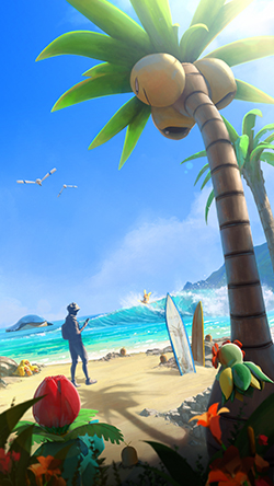
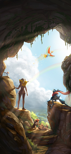
I like the Alolan loading
screen. Every time I see it, it still makes me want to go to Hawaii!
Pokémon
GO startup screens often contain multiple smaller aspects that tell different
stories within the larger piece. What is your favorite component of each piece
that you’ve done, and why?
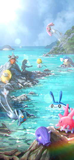
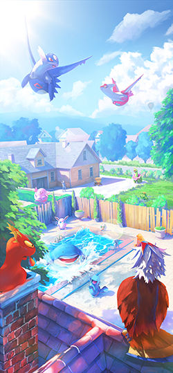
In the Alolan summer loading
screen that I did, I put Wailmer in the distance, as if it missed a party. When
I did the second summer loading screen in 2019, I thought it would be fun to
repeat that. And in the
summer loading screen in 2020—the one that Saro did—Wailmer finally made
it to the party! I thought it was a fun narrative that a lot of people may not
have noticed.
I also liked the narrative of the PvP loading screen
that got swapped to the fireworks for New Year’s, and all the Pokémon and Trainers
stopped the battle and looked at the fireworks.
Artist: Saro Orfali
Do
you have a favorite piece of startup screen art that you’ve created?
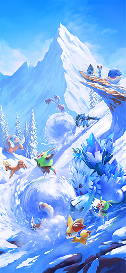
It’s very hard for me to
choose my favorite, as there are a few that I really like. But if I had to
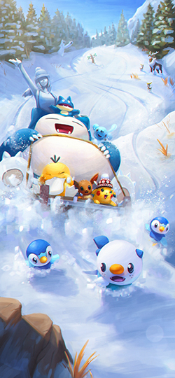
choose, I would say the Winter 2020 one is one I’m very proud of. I love the
camera angle I chose for it. Usually that wouldn’t be an angle I would go for,
but for this specific story, it just works well. I love the storytelling of the
painting. I wanted it to be very playful. I like how Furret gets stuck in the
snowball while going downhill. The idea was that it was helping to roll the snowball
before you see the current shot but somehow got stuck in it in a playful way.
I love the way Chespin is running and kicking
its feet, trying to keep up. There is a sense of comedy and fun in the piece
that makes it my favorite. Compositionally I think it’s strong, and I also like
the color palette. It was a challenge not to make it look monochromatic because
of the snow by adding hints of color here and there. The contrast of the
Pokémon helped add variety.
I have to add that my second favorite is from
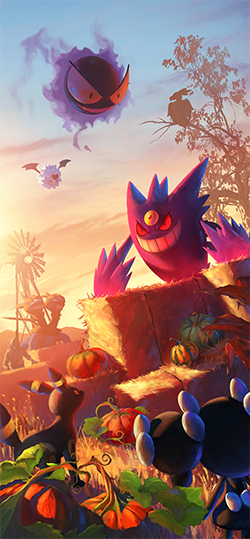
Halloween 2020, especially the color palette and the mood. I tried to do
something different for the Halloween one and not a typical night and moon
look.
Where
do you draw your inspiration from when creating these pieces for Pokémon GO?
My process starts in
looking at reference for that specific loading screen on Pinterest. I make a
folder and put all my references in there. I look at anything that pops to me.
It could be lighting, composition, color, mood, etc. from a painting or a
photograph. I look for things that pique my interest, and I save it. If I see a
photo that triggers an idea, I’ll save it. Then once I’m done, I’ll look at my
ref again and start my sketches based on those.
Sometimes I find photos that have nothing to
do with the theme I’m doing but something about it triggers an idea that could
potentially be an interesting one. The idea is to get inspired and start ideas
to flow in your head as well as executing the painting from real photos to make
it look believable.
On top of that, inspiration also comes from
sketches I have done for previous loading screens. I’ll revisit them to see if
there are ideas that we didn’t pick that could have potential or make some
changes to it and make it work for the current season.
What
constraints or aesthetic challenges do you need to take into account when
creating artwork specifically for a smaller canvas like a mobile screen?
When I’m working on my iPad,
I work large, but I’m keeping in mind that on my phone, things are going to
look smaller. So I constantly look at it on my phone to see if things are
reading well.
Since it’s on a smaller screen, I keep the
painting loose to a certain degree. I like those loose, meaningful brush
strokes. They are hard to achieve, but once you get it right, it looks great!
Are
there any little details that might get overlooked that you really appreciate
in any of your pieces?
When I’m looking at it on my
iPad, I see all the nice brush strokes and detailed color. Once it goes on the
phone screen, it’s a bit harder to see it, but overall the painting works. So
being bold sometimes with your brush strokes help make them pop on the phone.
Artist: Jason Marino
What
was your personal experience with Pokémon before working on this project?
From
the moment Pokémon aired on our fuzzy TVs, I was hooked. A Game Boy Color, Pokémon
strategy guide, and, of course, Pokémon Red—was there really any other
choice?—were the very first things I saved my hard-earned allowance for. I
remember staying up late to memorize all 151 Pokémon and their Evolution levels.
Soon after, I was collecting Pokémon cards and enjoying the beautiful art. Fast
forward 25 years, and I never would’ve thought I would also be creating Pokémon
art!
How
would you describe your style and aesthetic as an artist?
I try to have a much looser and free-flowing
approach, leaving brush strokes and energy visible. Some of my favorite artists,
such as Claude Monet and J.C. Leyendecker, were masters of this—being able to
show form and energy through their paint strokes. Now I just need to get on
their level.
Which
Pokémon is your favorite and why?
Charizard, of course! To me, Charizard is
strong but has a big heart, full of willpower, and always takes its own path, encompassing
a lot of traits I see in myself. It also helps that the design is the best!
Do
you have a favorite piece of startup screen art that you’ve created?
By far my favorite was the
2021 New Year’s loading screen. 2020 was a very tough year for the entire world,
and this was a moment I could bring a reminder not only to our players but even
to myself that better days are ahead.
Where
do you draw your inspiration from when creating these pieces for Pokémon GO?
The best place I’ve found inspiration is
through life. You’ll never be able to create anything more unique or genuine
than what we see and feel in our world.
The
startup screens intend to set a mood for players before they start exploring. How
much do you think of that goal when you design your art?
It’s really important—so important that I
usually spend days just brainstorming, looking around to see what mood I feel
is best for the season we are in in the game and in real life.
Do
you have any personal techniques for getting into your creative space?
Getting into that creative space can be hard
sometimes, so music really helps set a tone and gets me started. I listen to
all kinds of music and will pick something related to what I’m working on. But
I am a 90s kid, so it’s very likely I have my old-school 90s R&B going!
Pokémon
GO startup screens often contain multiple smaller aspects that tell different
stories within the larger piece. What is your favorite component of each
piece that you’ve done, and why?
In the New Year’s piece, I had two Litleo
playing in the bottom. This was a fun reference to my daughter and how kids
through the pandemic still were joyful, positive, and full of energy while
sheltering in.
What
constraints or aesthetic challenges do you need to take into account when
creating artwork specifically for a smaller canvas like a mobile screen?
One of the biggest challenges is not having
Charizard in every loading screen! But once I get past that hurdle, creating an
image that fits all phone aspect ratios. We don’t want any story moments to be
cropped out for any of you.
Given
that each art piece is sort of an iconic representation of an entire season,
how do you choose the locations for your pieces?
We really want to represent landscapes and
areas all over the world to encourage exploration. When choosing one, I will
look for a place that I’d love to explore myself.
Art by Mieke Hutchins
The inspiration, effort, and love of Pokémon
that go into these startup screens are truly awe-inspiring. Here’s to many more
beautiful startup screens as players get up and GO for years to come.
Source: Pokemon


